meijer mobile app

introduction
Meijer stands tall as one of the major grocery chains, serving communities across the Midwest. As a cornerstone in the retail landscape, Meijer seamlessly blends traditional in-store experiences with cutting-edge digital platforms, including user-friendly apps and websites. With a commitment to providing unparalleled convenience, Meijer's digital ecosystem extends to accommodate the diverse needs of its customers, offering online ordering, efficient pickup, and reliable delivery services.
Dive into some of my design thinking, strategies, and creative solutions that fueled the transformation of Meijer's digital experience. Each project represents a unique chapter in redefining how Meijer engages with its customers in the digital space.
position
user experience designer, mobile app
key responsibilities
UX Designer
UI Designer
Mobile App Scrum Team Leader
User Flows & Wireframes
HighFi Comps & Prototyping
QA Testing
Lead Workshops
UX PI Planning
SAFe Agile Education
my role
I was able to work on the mobile app team as their scrum team leader to help assist in designing and innovating for their digital experience. I was the lead designer, of mPerks 4.0, a major overhaul that not only embraced Meijer's established branding but also introduced a new level of personalization and user-centric features. Additionally, I spearheaded the redesign of the account creation flow, streamlining the process to enhance user efficiency and satisfaction. Lead the futuristic beta project which added a layer of delight to Meijer's digital presence, infusing the platform with micro animations, illustrations, and thematic elements that celebrated holidays and brought joy to the user journey. I got to closely work with product owners, developers, and QA to define and implement innovative solutions for the product direction, visuals and experience. Designed and delivered wireframes, user stories, user journeys, and mockups optimized for wide range of devices and interfaces.
mPerks 4.0
how it started...
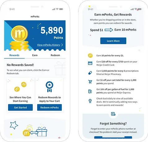
Welcome to the next era of savings with Meijer mPerks 4.0 – a transformative project where I played a pivotal role in revamping the rewards experience. Tasked with aligning the design with Meijer's established branding and design system, I crafted a rewards program that not only mirrors the beloved Meijer brand but also introduces unprecedented flexibility for users. In this innovative iteration, individuals have the power to customize their coupon selections, stack up points limitlessly, and redeem rewards tailored to their preferences. Join me in this exciting journey where familiarity meets innovation, as Meijer mPerks 4.0 redefines the art of saving with a touch of personalization.
reimagined
reimagined
reimagined
mPerks as we knew it...

01
rebrand of mPerks
Looking back to how mPerks started, a rewards program that was very outdated and not engaging for the users. The users would occasionally get rewards during checkout at the POS machine, or they would get coupons mailed to their house. There was an online experience where you could go clip coupons, but most people would forget to do this or not even know it existed. This started the conversation of mPerks 4.0, a completely user centric rewards program that was going to excite the users in a new gamified experience.
That is where the mPerks rebranding came into place. Going off the current Meijer brand that everyone knows and loves, mPerks already established a rewards program that resonated with their loyal customers. So I wanted to build off of what the users are already used to with mPerks. By taking a look at what was already their and pushing it to the next level, a fresh new look for mPerks that would get people excited to save money!
inspired by the current logo, the coin was invented.

original mPerks logo

mPerks coin

coin reimagined
02
method
I learned quickly that introducing a new loyalty program can be a little daunting, but creating an educational visual language can help. Creating a visual story that explains the relationship between mPerks and rewards concisely. I built off the idea of the mPerks “m” becoming currency so customers understood they were either earning money or redeeming rewards with their “money”. Now Meijer’s new rewards program is as easy as earn, redeem, and save.

Fresh Usage of Meijer Branding
Our bright brand colors create an inviting experience that resonates with Meijer’s Roots.

Graphics Paired with Concise Language
Creating scannable content allows our users to understand messaging without reading.

Infused with a Gamified Spirit
Gamification creates engagement and celebrates Meijer’s unique savings.
03
implementation / hifi comps
I added dimension to Meijer’s current digital visual language to seamlessly integrate mPerks gamification into their existing platforms. By pairing gamified elements with best practices in UX to entice users to engage further with mPerks. Gamifying the point system to really encourage customers to engage even more. I also utilized Meijer’s current brand to aid in the new visual language so the users would see familiar elements and have a feeling of trust. From there I applied this visual language to screens and brought it to life with a new transformational experience. Built to respond on all IOS and Android platforms, as well as working omnichannel with our web team and creating an entire responsive web experience.


04
so what are you waiting for?
Start saving today and be in charge of exactly how you want to spend your hard earned points. Meijer is determined to reward their customers for being so loyal all these years. So earn even more rewards by doing what you already do. So get ready to reward yourself daily!


account creation
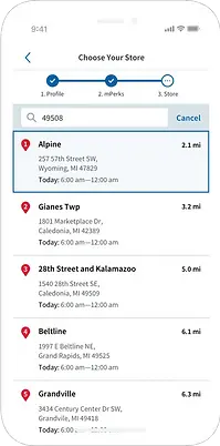
I spearheaded the redesign of Meijer's account creation process, streamlining the once lengthy signup journey from an average of 2 minutes and 30 seconds to just one minute, resulting in a notable decrease in drop-off rates. The significance of this transformation lies in the enhanced efficiency and user-friendly approach, reducing friction for potential customers. By minimizing requirements and simplifying steps, I not only saved users valuable time but also significantly increased sign-up rates, fostering a more engaged and retained customer base for Meijer. This optimization not only improved the onboarding experience but also contributed to a more seamless and positive relationship between users and the brand.
Starting with the onboarding screens I welcomed our Meijer customers the way you would in a store with a smile and hello with our visual branding. Lightening up the initial screens gave their customers a more enjoyable, and warm welcome that they would expect with Meijer.
Let’s greet our Meijer customers in our app the same way we would in a store.

01
account creation & onboarding wireframes
I kicked off the Meijer account creation makeover by cutting out the unnecessary fluff. Instead of bombarding users with a laundry list of questions, I started thinking about what Meijer really needed to know for a user to set up their account. Taking a deep dive into the current flow and seeing where users were dropping off and understanding why? A user doesn’t want to give up all their information right after downloading an app and if to many unnecessary questions are asked the user will just leave. Starting with wireframes we opened up all the questions like “What information is required for a user to successfully set up an account?”. After some concepts I put the users to the test and did some user testing, I watched closely to see where folks stumbled or got stuck. I found out that less is more and they want this to be quick. Plus, we figured out that giving new users a little tour with a friendly slideshow to just summarize the app and what being an account holder gets them was helpful. It’s like giving a warm welcome in a physical store, utilizing bespoke illustrations to invite users into the application. After a bunch of tweaking and testing, I nailed it—making signing up for a Meijer account quick, easy, and crystal clear for everyone involved.
initial concepts / wireframes

02
final comps & user testing
Following a methodical exploration of the optimal user flow and essential steps for account creation, I rigorously tested and refined our findings. Incorporating Meijer's branding, I translated the selected concept into a polished, high-fidelity composition and a functional prototype. Next users were put to the test, where they were asked to set up an account using our prototype that emulated the account creation process. Through meticulous analysis of user interactions, I achieved a seamless and efficient account creation flow, resulting in a significant reduction in the drop-off rate and a threefold decrease in sign-up time. This refinement reflects not merely an improvement but a substantive transformation of the overall user onboarding process.

profile

mPerks

store


futuristic project
Delving into an in-depth analysis of our digital landscape, our team undertook the task of strategically infusing elements of joy and personalization. My focus extended to identifying opportunities within our digital experience to enhance user engagement, particularly with a program like Simply Give. Simple Give, is a year-round program that has helped local food pantries keep their shelves stocked since November 2008. Recognizing its underutilized potential, we brainstormed innovative ways to spotlight the program, contemplating a dedicated landing page that could effectively communicate the impact of user contributions. With a forward-thinking approach, I conceived the concept of a dynamic "giving tree" mindset. With each user donation, the tree would flourish, evolving into diverse environments and scenes tailored to different holidays. This thematic approach extended across the entire digital experience, incorporating micro animations and illustrations that seamlessly integrated with each user's journey, creating a cohesive and delightful digital environment.

holiday landing page

infuse fun all year!
Embarking on a forward-looking initiative, I delved into a project geared towards infusing a touch of personality and customization into Meijer’s digital experience. Aimed to elevate the overall user experience by introducing engaging elements such as micro animations and illustrations. The strategy involved a thoughtful consideration of various holidays, strategically implementing thematic elements across Meijer's digital platforms to evoke joy and resonate with users. From lively banners adorning web pages to delightful loading moments, every interaction was an opportunity to create a lasting impression. The goal of this project was to explore new ways to bring joy to our users and make a more lasting impression on their experience that they have with Meijer. Starting with a landing page for one of our biggest holidays to reward our users and give them information to help guide them during the holidays. This is something that can be customized for each holiday and give recommendations based on each user and their needs. This initiative will transform our digital landscape, turning routine engagements into memorable, joyful experiences for our users.

think about micro animations and fun illustrations that makes Meijer more memorable

customize each users experience & make it more fun!


